Monday 10 May 2021
Optimization of reporting dashboard or report how to manage?

In the age of Big Data, it's extremely important to know how to handle the data you collect. Understanding and interpreting results, determining whether objectives have been met, understanding which elements are causing your indicators to fluctuate positively or negatively, and identifying levers for action are all elements you need to determine for the smooth running of your business.
Whether dashboard or report, there are numerous formats for capturing data and presenting results. It's important to distinguish between what's a dashboard and what's more like a report.
These 2 tools are complementary and do not meet the same needs.
That's what we're going to explain here.
The dashboard: a summary tool
The dashboard is a way of presenting information in a summarized form. Let's not forget that the dashboard was originally designed for the driver, to provide information about the vehicle. Information must therefore be simple and concise.
The dashboard is also characterized by the fact that it is connected to data in real time, giving you up-to-date information on the indicators you're tracking. It enables you to make rapid decisions based on up-to-date indicators.
You can decide to track the fluctuation of a score as well as the target set for it. In our case, your Customer Satisfaction Dashboard will enable you to keep an eye on your NPS, see its rise and fall over a recent period and, above all, see the gap with your target.
There's no need to wait for the monthly update or the alert indicating a loss of 10 points on your score. The dashboard is an invaluable aid to managing your business, and enables you to be proactive in your approach.
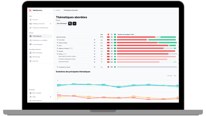
Our Feedback solution now enables users to manage their own customer satisfaction dashboard using widgets. A dashboard is defined as a view grouping together several widgets. Each widget highlights a datum or the fluctuation of a datum of your choice.
Dashboard interactivity
As already mentioned, the dashboard can be used to highlight simple data, such as customer satisfaction:
- NPS for the current year,
- Top 5 of my sites,
- Flop 5 of my regions,
- Evolution of overall satisfaction over the last 6 months...
This allows you to keep an eye on the indicators that are important for your business.
Feedback widgets follow this philosophy. A widget = a simple graphic (a table of no more than 5 lines, a key indicator, etc.).
As the widget is interactive, it really is a gateway to more information. If you're interested in the summary information provided by the widget, you can click on it to access more detailed information.
When faced with an indicator that fluctuates noticeably, whether up or down, you can access more data at the click of a button and understand the reasons for this change. In the event of a drop, you can quickly intervene on the subject of dissatisfaction; in the event of an increase, you can identify the subject of satisfaction and pass it on to other activities, hoping to see the same result.
The report: detailed and comprehensive
The report has another purpose. Originally, a report generally provided data in tabular form over several pages. It was then used as a basis for generating other documents, or as a check on operations.
The report provides the reader with complete, detailed information over a defined period: daily, weekly, monthly, annually...
Its purpose is to extract data so that it can be compared with other data from previous periods, or from other activities, to gain a better understanding of certain trends. It's also a format that allows you to stop looking at information over an X period, and to take a step back and look at it as a whole, cold, and no longer steer "day by day".
In a customer satisfaction report, you will have access to much more detailed information, such as :
- Overall satisfaction score for all my sites
- NPS score for all my regions
- Detailed score by measured attribute
Shorter and more digestible, summary reports nevertheless retain a control function over fixed data. They can incorporate graphs or color codes, but differ from dashboards in the amount of information they provide to readers.
How do you work with both formats?
Dashboard or report: they complement each other because they do not serve the same purpose:
Dashboards: simple, real-time information for rapid decision-making.
Reports : detailed information, over a set period, for concerted decision-making.
It's always possible to mix the 2 with a very long, interactive and detailed customer satisfaction dashboard. In our experience, such dashboards are very expensive to maintain. What's more, they are rarely consulted, let alone understood.
In this case, the question is not dashboard or report, but dashboard AND report!
Our advice: a good dashboard should contain no more than a dozen elements. To do this properly, it's best to generate several dashboards, to meet different needs.